Tide app feature
Easy and Clean Interface
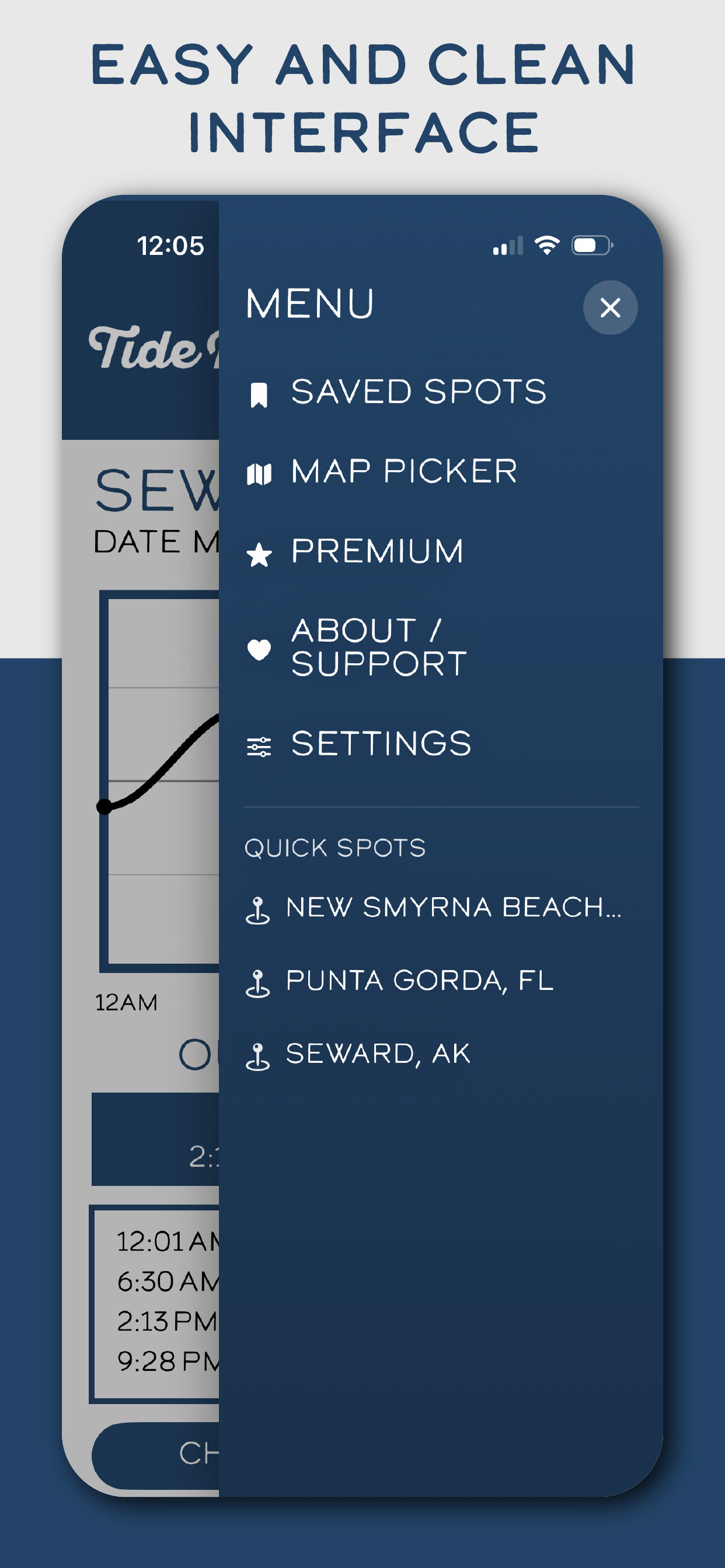
A tide app should not feel like work. Tide Buoy keeps the navigation simple so you can jump into saved spots, the map picker, premium, support, and settings without fighting the interface.
Why this feature matters
A cleaner interface means less time hunting through menus and more time actually using the information.
Many tide checks happen outside, in a hurry, or with one hand. That makes spacing, contrast, and visual simplicity especially important.
An app that feels calm and understandable gets reused more often than one that feels crowded.
How Tide Buoy uses it
- Keeps the main navigation focused on the features real users come back to most.
- Uses simple wording and large touch targets for faster movement through the app.
- Supports repeat daily use by reducing visual noise.
Best real-world uses
- Opening the app quickly before a surf or fishing stop.
- Jumping back into saved spots without digging through layered screens.
- Helping new users understand the app immediately.
Want to try this in the app?
Tide Buoy brings this feature into a simple, mobile-first tide app experience built for the coast.
Related features
FAQ
Easy and Clean Interface questions, answered
Clear answers help both humans and search engines understand what this Tide Buoy feature actually does.
Why is a clean interface important in a tide app?+
People often check tides outside, in a hurry, or one-handed. A simpler layout makes the app faster to use and easier to trust.
Does Tide Buoy still keep advanced features?+
Yes. The app stays simple up front, but it still includes the tools people need for tides, maps, saved spots, and planning.